
 |
|
 |
|
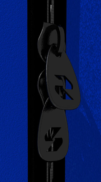
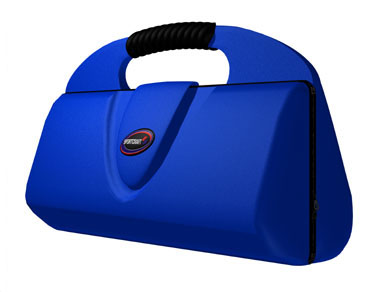
| Beyond the zipper detail, the client was able to see which design would have the most effective branding. Click here to see a Quicktime movie of the top bag rotating. | |
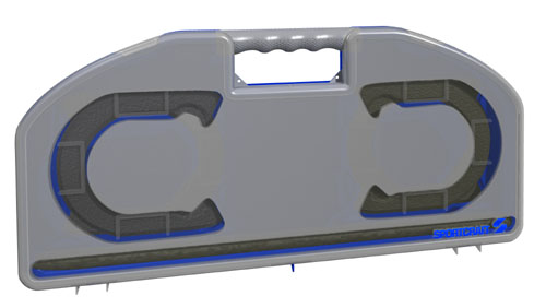 |
Here is the original version of the case. This was inspired by the multi-colored iMac craze and the the plastic was designed to allow the potential buyer to see the contents while not taking away from the cool style and coloring. The logo on the bottom right corner would need to be painted or have a sticker applied. Click here to see this case rotating in a Quicktime movie. Every detail is realized so no effort is wasted making a prototype that will be inferior to what will eventually be on the shelves. |
 |
 |
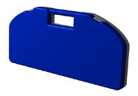
| The final case had better branding with no need of paint or sticker application on the logo as the original needed. Click the above case to see the Quicktime movie for this version. |
 |
 |

